Editorial hierarchy
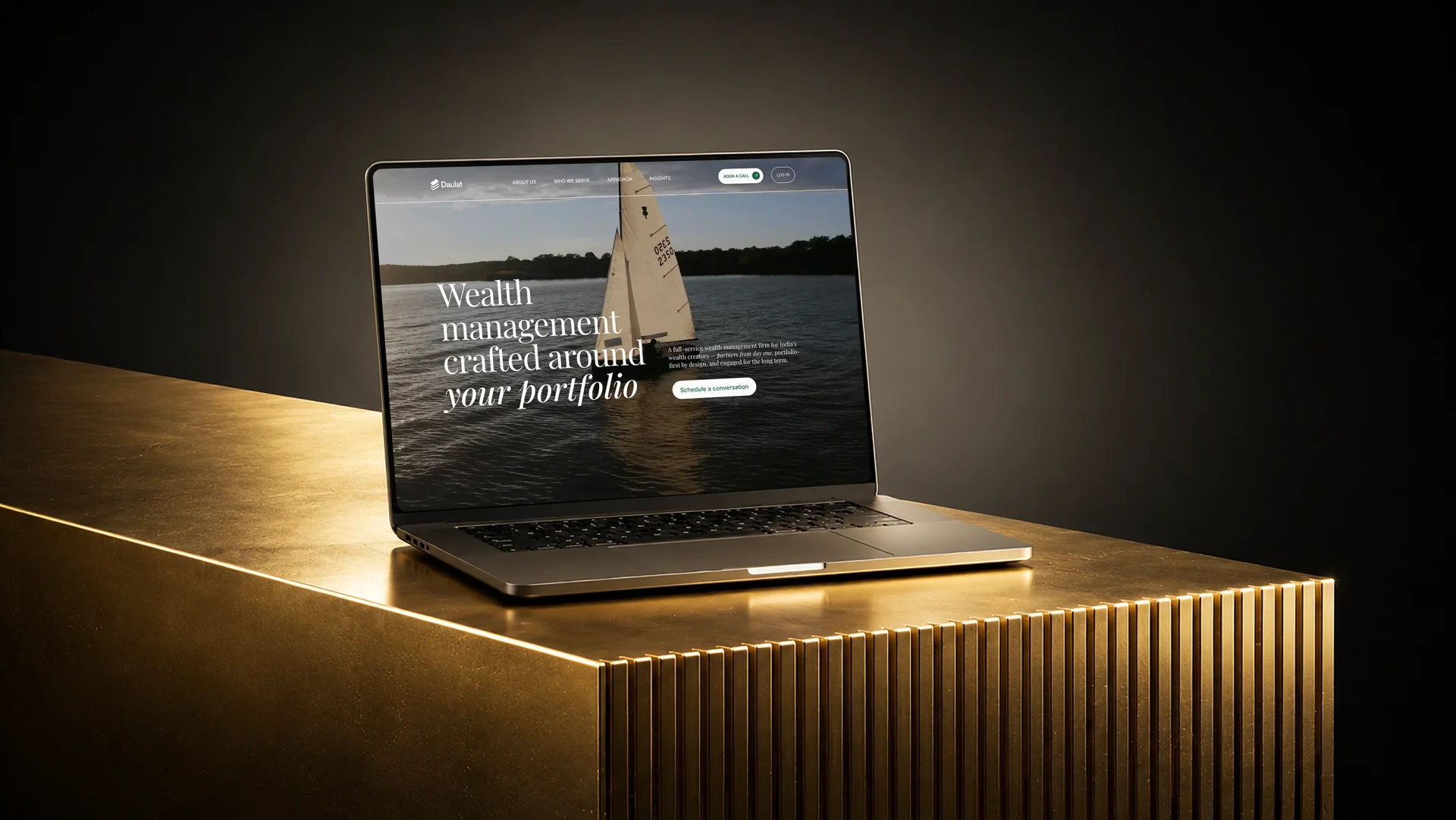
Large statements introduce a point of view. Shorter passages explain what it means in practice. Instead of giving every service and credential equal weight, the page tells the reader what matters first.
Daulat · Wealth management · Website design
Daulat's expertise was already serious. The website direction needed to make that expertise easier to understand—without turning the firm into another wall of financial language and generic claims about trust.
The brief
Wealth-management websites tend to fall into one of two patterns. Some feel formal but interchangeable. Others try so hard to appear modern that the substance becomes difficult to find.
Daulat needed a more useful balance: a first impression with authority, a clearer explanation of how the firm thinks and enough warmth for a relationship-led service.
The work began with the business and client profile—not with decoration. What should a prospective client understand first? Which ideas deserve emphasis? Where does proof belong? And how can the visual system support calm attention instead of competing for it?
The direction had to establish credibility, make Daulat's philosophy legible and give the founder and client relationship an appropriate presence—without manufacturing urgency.
Large statements introduce a point of view. Shorter passages explain what it means in practice. Instead of giving every service and credential equal weight, the page tells the reader what matters first.
Typography, spacing and colour create composure rather than spectacle. The page feels distinctive through confident scale and pacing—not through decoration that competes with the subject.
The story gives greater prominence to Daulat's point of view, its founder and the client relationship. The site becomes an introduction to how the firm thinks, not only a catalogue of financial products.
The process
The useful work happened before the visual polish: understanding the business, its audience and the ideas a prospective client needed to carry away.

In the client's words
“Shubham displayed thorough professionalism throughout the process. He displayed a keen interest and eagerness in understanding our business and client profile before diving into the design journey. We were impressed by his attention to detail and willingness to go above and beyond. Highly recommend him! You would be in a safe pair of hands.”Varun Fatehpuria · Founder & CEO, Daulat Wealth Management
What it demonstrates
Credibility is cumulative. It comes from a clear proposition, readable hierarchy, specific language, appropriate proof, careful restraint and a low-friction route to the next conversation.
For a founder-led or high-touch financial firm, hiding the people behind the service can make the business feel less established, not more. Personal presence and institutional credibility can reinforce one another.
This case study does not claim a conversion lift, search result or revenue outcome. Those outcomes were not supplied or independently measured by Tempo. The evidence here is the approved work, the reasoning behind it and the client's account of the collaboration.
The process can be reused. The visual answer should not be. Every direction should begin with the firm's own proposition, audience and proof.
“Trusted advice” is not a position if every competitor says it. Explain what the firm believes and how that changes the work.
Credentials, founder context and client language are most useful where the reader is already evaluating the relevant promise.
For a high-touch service, the people responsible for the work are part of the reason a client chooses the firm.
Restraint is not the absence of design. It is the decision to use contrast, motion and scale where they improve comprehension or memory.
Related thinking
Explore the service behind this work, or use Tempo's practical notes to prepare a clearer brief and evidence inventory.
Tempo designs websites and brand systems for founder-led financial companies that need clarity, credibility and a point of view.